Website structure design for multiple languages (Aug 2020)
17-Nov-20: Added green webfoundation logo to the index and topic pages. The logo is in the page link on the right, so only visible in the widest screen mode.
25-Aug-20: Made website layout responsive to width of screen. Now there are 3 layouts, see section below on website layout design. See the result by reducing / changing the window size. See also section Media query.
- Large screens (width > 1400px). This has the menu on the side and room for page links on the right.
- Medium screens (900 < width < 1400px. This has the menu on top and no page link section.
- Small screen (width < 900px). This has double menu row on top and no page link section.
22-Aug-20: Used CSS grid for site layout. Added results of tests with css grid.
16-Aug-20: Started using prism, see prismjs.com, to highlight code snippets for CSS, HTML, Javascript, PHP and Visual Basic. See section Code highlighter prism below for my implementation.
17-Jul-20: Redesign of website. Use flex box for menu.
Contents
Folder structure
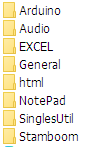
Since I have different independent topics for the website, I decided in an early stage already to give each category / topic its own folder. For common used components I created a folder named 'General'. Currently in the General folder there are the CSS (cascading style sheet), Javascript and PHP (Hypertext Preprocessor) files. Some of these will be explained further below. For topics that contain subtopic or sections I created sub-folders to keep things tidy.
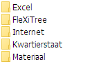
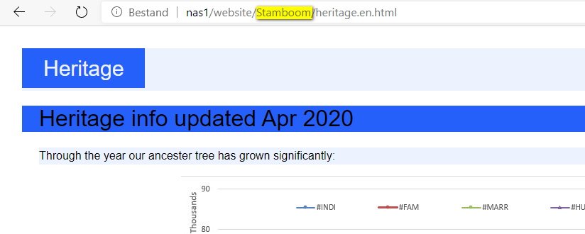
Some of my topics were initially made up in Dutch language and some in English. The name of the folders is therefore a mixture of Dutch and English, dependent on which language the topic was initially created first. The folder name is visible to the user in the url in the address bar. So a user may see a folder name in a language he does not understand. For instance "rjut.nl/Stamboom/heritage.en.html" For me this seems acceptable. I make it also clear on the web page in what section of the site the user currently is. This is more prominently visible then the url in the address bar. See yellow highlighted text and the page headers in the screen shot below:
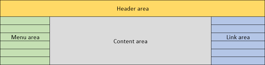
Website layout design
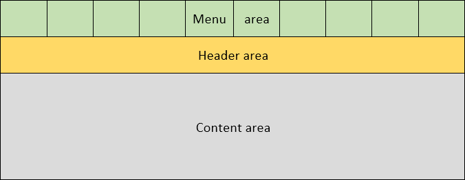
I wanted a simple design with a header on top of the page. A menu to the left. The main content in the middle and optionally (depending on the page shown) page links at the right side of the content. So graphically I wanted the following areas:
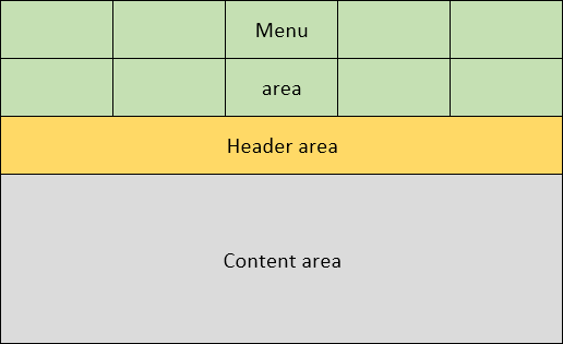
To achieve this I wanted to use the new grid functionality in CSS. This would also allow me to (easier) re-arrange the layout if the screen size changes. For instance I could place the menu on top with the content below and/or leave out the page link area altogether:
CSS grid
Before I would change all my site pages I first wanted to get some experience in using CSS grids. I have read some articles about grids. See for instance css-tricks.com for an excellent introduction and csswg.org for the official definition description of the grid. After this reading I made a test grid which resembles my website design:
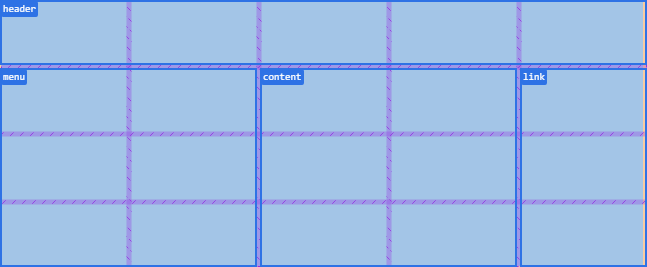
This is a 5 column grid with 4 rows. The first row is intended for the header. The menu area has 2 columns. In the real site this would probably changed to a single column. To fill this grid with content in html you can use the following code:
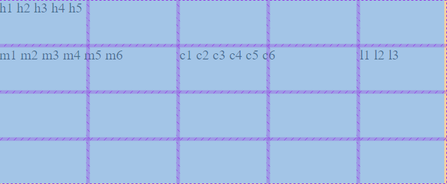
I used ccs code inside the html file to keep everything together. The grid is made up of 5 columns of 100px wide and 4 rows of 50px high. I have made the body element the container. In the html body section there are 20 elements that will be placed inside the grid. This is done by the auto placement functionality of the grid. Each element is called a child of the parent container. I have used the <span> tag for the children. This could have been other tags. I choose these because span is an inline tag. Notice the order in which the children are. This is because the auto placement algorithm by default orders things from left to right then top to bottom, starting in the top left corner. The browser would show this page as:
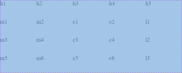
So the result seems ok. But the order of the elements in the html is inconvient.
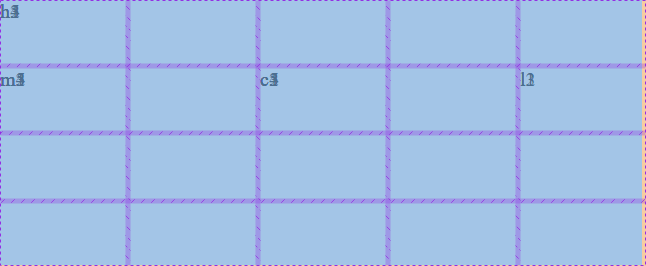
It is possible to change the direction of the auto placement function from left-right to top-bottom. This can be done by setting the attribute grid-auto-flow: column. With this attribute and to keep the same elements in the same cells the code changes to:
The net result is the same. Click on the code to see it in the browser. Notice the extra line in the CSS grid definition. Also notice the changed order of the elements in the HTML code. This to reflect the vertical placement algorithm. Needless to say this is also not very convenient.
Therefore I started using area names to be able to position the elements easier. Also rearranged the elements so that they are in a logical order. This resulted in the following code:
In the grid definition there now is a new attribute grid-template-areas. With this attribute you indicate to what named area each cell belongs. Next you can define a class header that refers to the grid area header (.header { grid-area: header;}). In the HTML code you assign child elements to the appropriate class. However the result is not what I had expected:
The elements of the same type are behind each other and in the same cell!
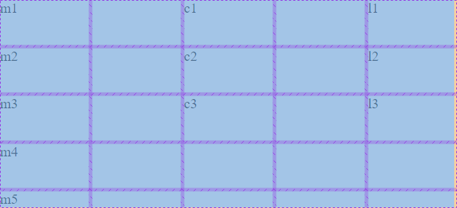
Next I tried to assign each child directly to the class of the grid area (eg <span class="header">h1</span>). This results in the following code:
Which gives the following result:
This made it even worse!! All the elements of the same type are now stacked on top of each other in the same cell.
The following example demonstrates that you can fill multiple columns in a grid using the auto placement function. This is the HTML/CSS code:
Notice that I used grid-auto-flow: column; for the auto placement function to work vertically. In the assignments of the class .menu, .content and .link I have now used grid-column in stead of grid-area. For the content class if have used line numbers in the column assignment. This to demonstrate that using an area name or line numbers gives the same result. In the HTML code. the children elements for the content, link and menu column are mixed. This to demonstrate that due to grid-auto-flow: column; the auto place function will (re)start from the top of each column.
You could use the same to fill multiple rows. In that case you use grid-auto-flow: row; and of course use grid-row in the classes.
The result of Gridtest4:
Even though the menu area is 2 columns wide the m1 through m5 are all stacked in one column. m5 does not spill into the second column of the grid area in stead the grid expanded with an additional row. Notice that m1, c1 and l1 all start in the header row.
After some head scratching, re-reading the information and more testing I came to the conclusion that:
- The grid uses 4 boundaries to mark a single location / column / row / area in the grid. These are the grid-row-start, grid-column-start, grid-row-end and grid-column-end. For the auto placement function to kick in you need at least the grid-row-start and grid-row-end combination or the grid-column-start and grid-column-end combination to be auto i.e. not set. The auto placement also works when all 4 boundaries are auto i.e. not explicitly set.
- By using
grid-area : xxxxyou set all 4 boundaries at once. So the auto placement function will not kick in. - By using
grid-column: xxxxorgrid-row: xxxxyou set only 2 boundaries and leave the others auto. This enables the auto placement function to do its work. The auto place function will use the whole row or column to place elements. Additional rows or columns will be created if there are more child elements than fit the grid. - Even though an area has several cells you refer to a named area as a whole with e.g.
grid-area: menu;. The child element will be placed in the top left corner. - Subsequent children with a class to the same named area will either be added to the area as a whole (in case of a wrapper such as the div in gridtest3) or in the top left cell of the area (when each child refers to the area such as in gridtest3b).
- You can only define one
grid-auto-flowdirection, either column or row for one grid. This means you cannot auto fill a mix of columns and rows in a grid. - There is only one auto placement function for each grid. And it remembers the last used cell. This may be used as starting point to look for an empty cell for subsequent placements. This can give unexpected results. See for instance Gridtest4b where I changed
grid-auto-flow: column;togrid-auto-flow: row;. Now there are gaps in the columns. - Auto placement cannot fill a sub area (wider than 1 column or higher than 1 row) of a grid, only the whole grid.
I could not find a solution on the internet to auto fill and area so I decided to try a grid in grid, or nested grid. In the top level grid I create 1 cell for the menu, content and link area. Then I made classes for the header, menu, content and link area. But these classes in themselves are also grids. The header is a 5 columns single row grid that fits into the top level grid. The menu resp content is a 2 column 3 row grid that fits in the menu resp content area of the top level grid. The link area is a single column with 3 rows. Notice that the top level column widths and row heights are increased to fit the columns of the nested grids. In the HTML code I use a wrapper for the children which holds the nested grid. The children can be placed in an area cell by the auto placement function. This results in the code below:
The container class is the top level grid with names of the areas. The header, menu, content and link classes are also grids that sit inside the named cell of the container grid. Because the column and row dimensions match it looks like one grid in the browser. The HTML code is identical to that of gridtest3. The difference is that the class now refers to a grid instead of an area within a grid. The result / output now is:
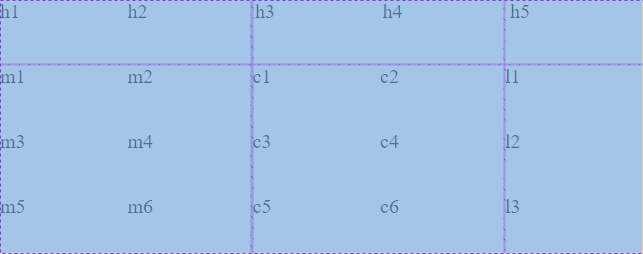
As you can see the result is now the same as in the gridtest1 and gridtest2 but with the advantage that the HTML code is in a more logical order. I now use this technique for the menu in this site.
Conclusion: To auto place elements in a named area or sub area or section on a grid you have to use a grid-in-grid or nested grid technique.
Note that grid-in-grid or nested grid is NOT the same as the so-called sub-grids that are part of level2 grid specifications (not supported by browsers yet). See the w3.org website for the level2 grid specification.
Site menu
To make it more convenient for the user to browse the site I initially used an iframe for the menu links. The advantage of the iframe seemed that you can put the code for the site menu links in a separate html file and open it in the iframe. The iframe has an attribute 'src' e.g. src="topicpage.html" which can be used to load an HTML page within the frame. It appeared that the iframe sizing is partly absolute. What I mean is that the iframe can be given an attribute width of 100%, so it scales with the width of the window. But the height cannot be set to the height of the window. A height of 100% results in the browser switching to an iframe height of 150 pixels. This is the default height of the iframe. Furthermore, a fixed menu always occupies space on the screen. Especially for smaller windows this is annoying. I am not designing the site to be easily viewable on a mobile phone but some flexibility for smaller windows than 1900x1080 seems desirable to me.
So I stopped using the iframe and starting with floating links on the top line of the page. This worked ok but I would rather have the menu at the left side.
These days I am using the CSS grid functionality to design my site. See previous section above on the CSS grid experiments.
To minimize the site menu code in each topic page, and to be compliant with HTML coding standards which states that HTML is all about content and CSS is all about design, this resulted in the following:
- Add HTML code for site links to every topic page
- Use CSS to position the buttons
- Use CSS to visualize the links to look like buttons
- Use CSS to switch screen dependent layouts
In the HTML file there is a line for each link. Including the text for the link and text for a tooltip if you hover over the link with the mouse. To give an impression of the code for the site menu:
Most of the above code is identical for each topic page. The disadvantage of this approach is of course that if the menu changes that each topic page has to be updated. With the Notepad++ session option and with my site's limited number of topics this is relatively easy to do. In a Notepad++ session you add all the files you want and open all relevant topic pages at once.
The CCS code responsible for the design of the site menu is as follows:
At the top some colors are defined that are used throughout the CCS. These are the 4 shades of blue, level 1 being the darkest.
The body is the main top level grid container. The .menu is a nested grid container for the site menu. The nested grid container for the page links is not defined yet, it is not used yet.
The '.menu a' classes definitions are to mark up the links to mimic a button.
The 'menu nav' section defines an underline for the current page. So the user can see where he is in the menu.
The '.header' class defines the background, position and font within the header.
The '.menu a:hover' shows the makeup when the user hovers over the link with the mouse. With these attributes you get a button like effect. The 'border-radius' gives the otherwise square background of the link a rounded corner effect. The 'transition-duration' makes the shape slowly change from a rectangle to a rounded rectangle.
Note: Margin is the outside space of the current element boundaries to other elements. Padding is the free space inside the current elements margin and the text. The Chrome and Edge (Chromium) browsers Developer Tool (F12 or Ctrl-Shift-i) is your friend here. It will show you the padding and margins clearly of a selected element.
Note: For a 'p' tag which is contained within a 'body' tag the (left, right, top or bottom) margin of the 'p' tag is from the (left, right, top or bottom) margin of the 'body' tag. You could say the 2 margins add up.
Media query
A media query can be used in the CSS code to conditionally execute statements and is comparable to a IF (condition) THEN (do something) statement. The media query condition can check device properties such as screen size. The section following the media query is executed when the condition is true. The media query to check the screen size used in this website is as follows:
@media screen and (max-width: 1400px)The condition is true if the screen size is smaller than 1400px. In the media query only the main grid and the menu grid is modified. But modifications are quit subtle.
This is the default CSS for the grids for the large screen. Main grid of 3 cols (line 5) and 2 rows (line 6). Header on the first row (line 8). Menu grid of 1 col by 11 rows (line 14) and to the left of the screen (line 9). Content in the middle and page links to the right (line 9).
For the medium screen size only the main grid and the menu grid CSS changes. The header remains the same.
Multiple languages
Because some topics were in English and some in Dutch I thought it would be better if the user could select a language and only present the pages to the user in the selected language. For that I needed to translate the topics into 2 languages and make a language switch. The challenge was how to setup the site to achieve a 2 language experience. After a search on the internet I came up with the following options:
- Use PHP to load correct language and cookies to store the selected language
- Use Javascript to switch language and use local storage to remember the selected language.
- Use HTML links to switch between languages but no possibility to remember the selected language.
Wanted to stick to the following starting points:
- Keep it simple. I only have basic HTML, CCS, Javascript & PHP skills.
- Keep the site search engine friendly (SEO = Search Engine Optimization)
- Loading and switching of pages should be quick for the user.
- Remember the selected language for a next visit. If no language is stored then do a best guess on the users language
I am not ready yet to use software like wordpress.org to build the site. Although this is probably very good stuff I like to understand how everything works. With such a tool I feel like I am no longer (directly) in control of the HTML and CSS code. This can be a benefit but I am not ready to take this step yet.
Therefore, I decided to use HTML to switch language and also to use Javascript to remember the selected language and 'best guess' the language if needed.
To store the selected language there are 2 possibilities:
- Cookies
- local storage
Cookies are small packets that are stored on the users local computer. They contain information relevant for the particular website, for instance sign on information. Cookies are sent from the users computer to the server with every page that is requested from the server. To keep the extra overhead low, cookies are limited in size. For this application this is not an issue. Cookies are predominantly used in combination with PHP which also runs on the server side. In my case I did not want to use PHP so cookies is not a good option for me.
The second option is local storage. Local storage is also on the users computer but it is kept local (hence the name). This means it is not send to the server. Local storage is allowed to be much bigger than cookies (Mb rather then Kb). Javascript can be used to set and retrieve the information which is stored as a set/pair of a name and a value. In my case name could be 'siteLanguage' and value could be 'en' or 'nl'. Local storage is stored as strings. For a language this is perfect. For binary data a conversion is needed. With local storage there are 2 flavors, one is called session storage and the other local storage. Session storage is removed when the user closes the browser. Local storage is kept on the computer even after the browser is closed. In my case I need the local storage. The local storage option is available in HTML5 supported browsers. All modern browsers seem to support local storage.
Search Engine Optimization
Search Engine Optimization is a set of actions to rank higher in the search engine results which are presented to a user. This will give a bigger chance that your site is visited. The things you can do to optimize your site are not completely clear (to me). Some parties claim they can get your ranking up if you pay them. If that is actually true I do not know but for this non commercial site obviously not an option. I did find the following tips / guidelines for search engine optimization which made some sense to me:
- Use a site map
See below for an explanation. - Use a title tag in the header section of the html page.
<title>website structure and multi language design<title> - Use a meta tag with keywords
<meta name="keywords" content="html javascript css php multi language dual language" /> - Repeat keywords several time on the page
- High-light keywords
- Use a meta tag with a description
<meta name="description" content="Considerations, choices and decisions made during design of my website, especially for multiple languages English and dutch" /> - Use links between the pages on the site
You will automatically have this if you add the site menu as HTML code to every topic and index page. - Update content frequently
- When referring to other site use the full url link.
In stead of 'see this site' use 'see modernizr.com'
Site map
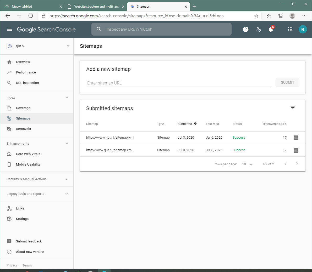
A site map is an xml structure file with a list of all relevant pages for your site. See the web site sitemaps.org for a more detailed description about a site map. A site map should help a search engine to index your site. A site map can be generated by some on-line tools, see for instance xml-sitemaps.com. The free on-line tools seem to be limited to the number of pages it will handle. This site has many (100.000+) html files in the heritage reporting section. So the on-line tool did not list all the topic pages. I modified the xml file myself and removed all non relevant pages leaving only index and topic pages.See below for an excerpt of the site map for this site. For convenience the file is shortened to only a few url's.
For an explanation of the meaning of the tags 'changefreq' and 'priority' see the sitemaps.org site.
Once you have made a site map file you need to store it on the website and submit it to the search engine for processing. You can store it in the top level folder. Submitting to google is done using the google search console. The search console will report on the status of the processing, see below. This can take a few days.
Page structure
Using the above considerations and analysis I came to the following structure and links between the pages:
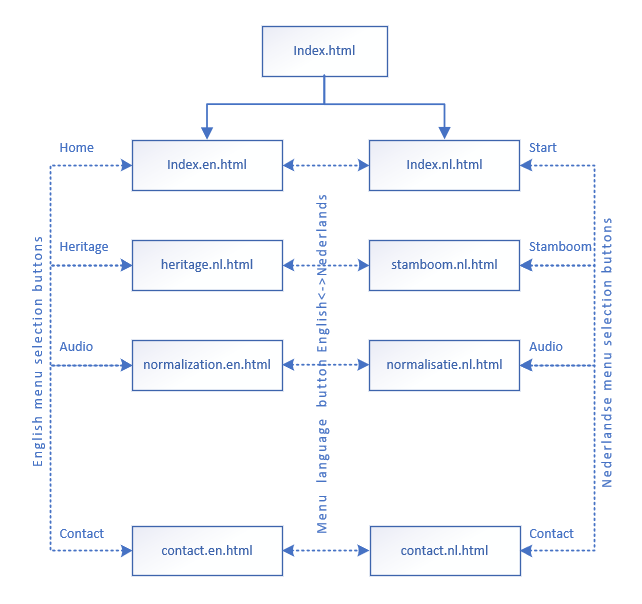
If the user types in the url of the website then the page 'index.html' is loaded by the server. From the 'index.html' the user is automatically and instantly referred to the correct language, either the 'index.en.html' page or the 'index.nl.html' page. For this Javascript is used. How this is done is explained below.
From the 'index.xx.html' page the user browses through the site using the menu links. He can also switch language. All this does is load the same topic page in the other language. The site menu changes depending on the language chosen. With the 'nl' site menu active the user is only redirected to other 'nl' pages and similar with the 'en' language. The Dutch site menu offers a link to switch to English and the English site menu offers a link to switch to the Dutch language. All this is done using pure HTML code, no Javascript is used for this.
Another advantage of this approach I believe is that when the user lands directly on a topic page without passing the 'index.html' page then the user would still see the site as usual including the site menu.
Modernizr feature detection
Because users may use older browsers when visiting my site I needed a way to detect if the browser supports local storage. This is where modernizr comes in. Modernizr is a collection of javascript code that can detect browser features. To find out if local storage is supported becomes as short as testing if modernizr.localstorage is true or not. To download the modernizr javascript go to the modernizr.com website, select the features you need and press download. Because only the features you selected are included in the download the resulting javascript file is very small. Add the file to the website (in my case the 'General' folder) Include a link to the file in the HTML page and you can use the mentioned test for local storage. Modernizr does not have a language detection option.
Javascript
As explained above Javascript is used on this website to:
- Redirect from the home 'index.html' page to the correct language.
- Store the selected language for subsequent visits to this site
With the dark shaded text boxes in the figure below is shown were Javascript is used on this website:
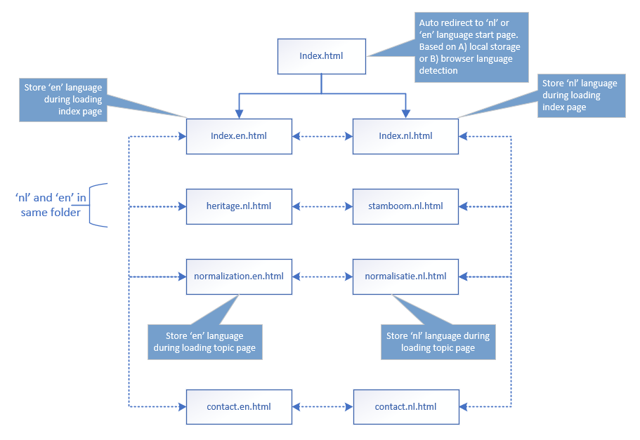
The javascript code is relatively small, written once and stored in a file with extension .js. This file is loaded by every page that needs it. Basically this is every topic page. Also the modernizer javascript is stored as a .js file and also loaded by every page that needs it. So in the header and topic pages you would see the HTML code:
The name of the modernizr javascript file is a bit cryptic. This is because I selected the features 1) local storage, 2) video and 3) xhr2 before downloading the file. I changed the downloaded file to the given name to be able to easily see what features are included in the modernizr javascript file. I will not even try to explain the contents of the modernizr javascript file. This is far beyond my programming capabilities.
Below is the code for the javascript file to store the language and to load the correct language index page:
This javascript basically contains 3 functions. These are explained below.
function StoreLanguage(lan)
This function is called when a page is loaded. A Dutch language page calls this function with the parameter 'nl' and likewise an English page calls this function with the parameter 'en'. First it checks if a valid language is requested. This is just a precaution but should always be the case. It sets the language to "none" if it is not one of 'nl' or 'en'. It then checks if local storage is supported by the browser, if it is then sets the variable SiteLanguage to the given language. Finally it outputs the language to the console for troubleshooting purposes. In Chrome or Edge Chromium the developer tools with the HTML inspector and console is opened with command F12 or Ctrl-Shift-i.
This function is called when a topic page is loaded. This is done in the body tag with:
<body onload="StoreLanguage('en')">function LoadLanguage()
This function reads the language from the local storage or selects language based on a best guess. First it tries to read from local storage. If this succeeds the variable language gets a value 'en' or 'nl' and the function GetLanguage() is not called. Finally the function load the correct page with the command: window.location.href = "index.en.html". This has the same effect as the user would click on a link, it load the page 'index.en.html. into the current window. This all happens so quickly that the user does not notice this and would only see the 'index.nl.html' or 'index.en.html' in the address bar.
This function is called only by the site 'index.html' page when it is loaded. This is done in the body tag with:
<body onload="LoadLanguage('en')">function GetLanguage(lan)
This piece of code I found on the internet and is supposed to be the best for guessing the correct language. Guessing, because this is not an exact science. The user may be Dutch but use an English language setting in the browser (as I usually do). If the wrong language is loaded the user can always select the link in the menu and the new setting is stored. This function is not called from the HTML pages but only from the LoadLanguage() function when local storage is not supported.
PHP contact form
For the contact form on the site I use PHP to send the email. For this PHP language code is embedded in the 'contact.en.php' page. PHP is an engine that works only at the server side. When a page is requested by the users browser the PHP engine first checks if the page contains PHP code and processes that if it does. After processing the page is sent to the browser (excluding the PHP code, but including any output of PHP processing). So the PHP code is processed and removed before the page is received by the browser. Hence the name Hypertext Preprocessor. When the user clicks on the form submit button the browser requests a page from the server. In the case of my contact form the page requested is the same as the page being viewed. The PHP engine can tell if the form has posted something by checking the request from the browser. If a so-called post request is detected then the email action is performed and a text is added to the HTML code to inform the user that the email is send.
The contact page has a menu like all other topic pages and 2 forms, one for each type of message. For simplicity sake I give below the text of the contact page without the menu and only for one form.
Initially the PHP engine processes this page but there is no action because nothing is posted. The browser will display the form. The make-up of the form is defined in the CSS file.
/* Used in the forms of the contact page */
label {
	display: inline-block;
	width: 200px;
}
legend {
	background-color: var(--level3blue);
	font-size:1.2em;
}
textarea {
	vertical-align: top;
}The next line defines that the browser should submit the information entered in the fields as a post request to the server. The information entered in the subject,email and message fields is all included in the post request and can be interrogated by the PHP engine with the line $message = $_POST['message1'];. This defines a variable $message that will be given the value entered in the message box of the form. The action="contact.en.php" part tells the browser what page to request in the post request.
<form name="email1" method="post" action="Contact.php">
PHP code can be anywhere in the HTML document as long as it enclosed with the correct start and ending tags. To output a msg from the PHP code to the user this line is placed within the body tags. Text is displayed just above the forms and below the site menu. The variable $msg gets a value when an email is send by the PHP engine or when a fault occurred:
<?php echo $msg ?>
The next line defines an input field that is used to trigger the post request to the server. Its is given a name that can be tested by the PHP engine.
<input value="Submit" type="submit" name="submit1">
The test for a post request is done in the very first line of the PHP code:
if(isset($_POST['submit1']))
Code highlighter prism
A code highlighter colors a piece of code dependent on the used language. It can format different parts / elements / keywords of the code in different colors. The result is more pleasing to the eye and better to read. A search on the internet showed that there are different ways of achieving this. I choose a so-called client side javascript highlighter. This means that the highlighting work is done by javascript on the users side after download. This adds some overhead to the loading time and the processing also takes some time. It looked to me that there were 2 big players using this principle, 'highlight' (see highlightjs.org) and 'prism' (see prismjs.com). I selected prism because the download page was a bit clearer to me and I liked the coy theme. In the download page you can select only the option you want. For me this was:
- Markup + HTML + XML + SVG + MathML + SSML + Atom + RSS 2.15KB
- CSS 1.23KB
- C-like 0.68KB
- JavaScript 3.19KB
- PHP milesj2.41KB
- Visual Basic + VBA Golmote1.93KB
- Theme: Coy tshedor3.93KB
- Plugin: Line Numbers kuba-kubula3.28KB
- Plugin: Unescaped Markup 1.47KB
The download is actually 2 files. One CSS file for the theme, 'coy' in my case and one file for the code highlighter for all the selected languages and plugins. In the download you can opt for a minified version and a developer version for the javascript. Normally you would select the minified version. In case you want to temper with the highlighting function you need the developer version. For me this is not needed. The minimized version is in my case 20kb and the CSS is 6kb. Does not seem to match the predicted file size on the download page, but both are quit small and comparable to a picture.
You need to add these 2 files to each page where you want to use the code highlighter. You do this by adding 2 lines to the <head> section in the html file:
You do not need to call the prism.js code from within the html to activate it. Apparently the prismjs code activates itself during page load and page refresh.
Now ,where ever you need to highlight some inline code you need to wrap the code with the <code class="language-xxxx">... some escaped inline code ...</code> tags in the html:
The xxxx need to be replaced with the code for the language used. In my case I have:
- 'markup' for HTML, XML
- 'html'
- 'xml'
- 'css'
- 'javascript'
- 'clike' for code languages looking like C++ (Arduino code).
- 'php'
- 'visual-basic' for Visual Basic and (EXCEL) VBA code.
Note the missing hyphen in 'clike'. The prism site could be clearer on what xxxx you need to use for each selected language. I had to look in the minified prismjs file to find out I needed to leave out the hyphen. Luckily the first line of the prism.js file already reveals this:
https://prismjs.com/download.html#themes=prism&languages=markup+css+clike+javascript+markup-templating+php+visual-basic&plugins=line-numbers+unescaped-markupNote that for xml and html code you can use either 'markup' or 'xml' resp 'html' for the language code.
'escaped code' means that at least all the < are replaced with <. Optionally you can also replace all the > with >. This is needed otherwise the html is messed up. Replacement makes the code in the HTML file difficult to read. And replacing could lead to mistakes. Would it not be better if you could leave in the < and >? Well, you can. You can use the plugin 'Unescaped Markup' for that. See the info page on prismjs.org for more info.
If you want to highlight a code snippet with more lines as a separate block you need to wrap the code with the <pre class="language-xxxx"><code>... some escaped multi line code snippet ...</code></pre> tags in the html.
What the prism.js code does is to search for <code> tags and <pre><code> tag combinations, check the language used and use a search & replace function to add html tags around the code elements. See below a screenshot from the Edge developer tool where you can see the markup added. This is only for 1 single line of HTML code:
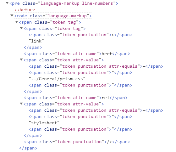
The search and replace is done with so-called RegEx functions. See my explanation on RegEx functions in the EXCEL section of this site. The RegEx search strings are stored in the prism.js file. You could modify these if you know you way around RegEx functions. The prism.css file will then make sure that the tags are presented in the chosen theme. You can modify the prism.css file to modify the theme. I have changed the blue left margin color of the code box to match the blue used on the site. Also changed the width of the code box and restricted the height to max 400px.
Switching to another theme means that you only replace the CSS file. It is advisable to leave out any html for the <code> and <pre> tags in your own CSS file.
Because I have also downloaded the 'unescaped-markup' plugin I prefer to use the following for HTML code snippets:
You only still need to escape any <script> and </script> in you snippet. I discovered it is enough to only escapre the < of the closing script tag.
So what about the performance of the page? This page has the most code snippets of all my pages. So I did a load test with and without the prism.js file included. I used the Edge developer network tab to reveal the loading time for the page.
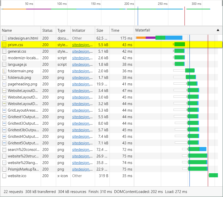
Note that I still include the prism.css file. Otherwise the code snippets would no longer be visible at all. The load time for the page is about 300mSec. This is the load time from the website to your browser and includes any processing on the client side. This will depend on your location and internet connection speed.
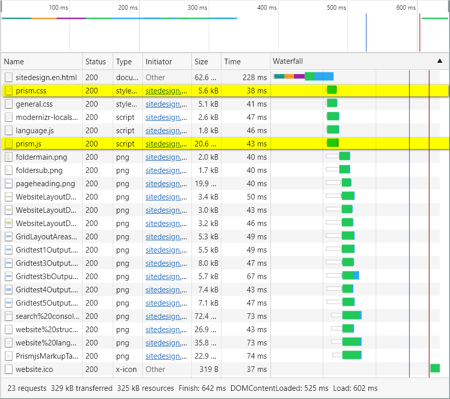
Now the load time is about 600 mSec. So this is 300 mSec longer than without prism.js. This shows to me that the prism.js needs 300 mSec to process all the code snippets in my file. For me this is acceptable. The 300 mSec would depend I guess on the processor used for the browser. In this case it was measured on my desktop with an i7 (Intel Core i7 3770 @ 3.40GHz) processor. With CPU throttling at 4x in the performance tab the load time goes up to 2250 mSec. This is probably more realistic for mobile and tablet devices.